Most people who run a local service business are not web people, and they do not have hours to spend second-guessing their website. They just want it to bring in calls. The trouble is that most advice online is written for marketers, not for the owner who cuts the checks and answers the phone.
This is the short version, drawn from real rebuilds of local service sites, including a recent one for a local water treatment company. None of it is about trends or looking clever. It is about the handful of things that decide whether a visitor becomes a lead or clicks away.
If your site already does the things below, you are ahead of most of your competitors. If it does not, each one is a concrete fix you can make without rebuilding everything at once.
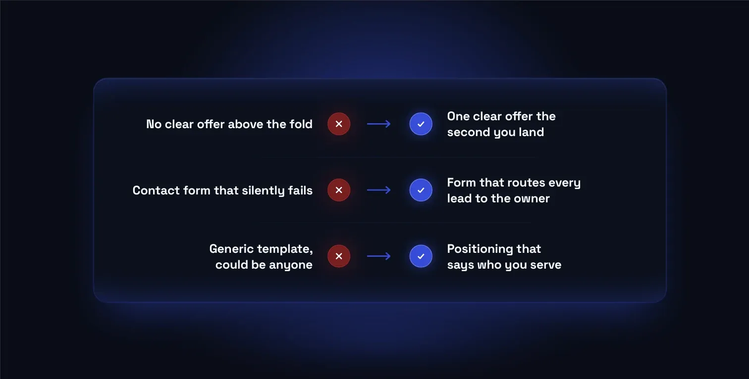
One clear offer above the fold
The top of your homepage has one job: make it obvious what you sell and why someone should care, before they scroll. Owners often bury this behind a stock photo and a slogan. A visitor should be able to glance at the first screen and know they are in the right place, with a single offer front and center rather than five competing links.
A hook that names the real problem
People do not search for your company. They search for the problem keeping them up: hard water wrecking their appliances, a rising bill, a repair that keeps coming back. When your opening line names that problem in plain language, the visitor feels understood, and that trust is what earns the next click.
CTAs repeated at decision points
One call to action at the very bottom is a missed opportunity. People decide to act at different moments: some after the first line, some after reading proof, some after pricing. Placing a clear next step at each of those points, without crowding the page, meets the visitor wherever they happen to be ready.
Built mobile-first
Most local searches happen on a phone, often while the person is standing in the problem, like a flooded basement or a broken heater. If the page is slow, cramped, or hard to tap, they leave before they read a word. Designing for the small screen first keeps the fast path to contact intact for the people most likely to call today.
Quick self-check
Run these against your own site. Every no is a fix worth making.
- Does your homepage say what you do and who it is for in the first line?
- Is there one clear offer above the fold, before anyone has to scroll?
- Does your opening name the problem your customer actually has, in their words?
- Can a visitor take the next step without hunting for a phone number or form?
- Does a call to action repeat at each point where someone decides to act?
- On a phone, does the page load fast and stay easy to tap and read?
If your site looks fine but never quite says what you do, a rebuild usually pays for itself in the first few leads. We start with a paid presence audit that shows exactly where visitors are dropping off.